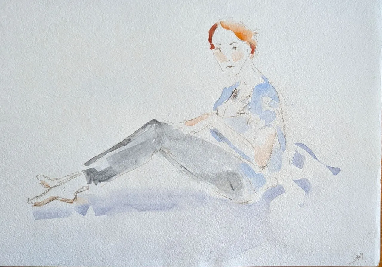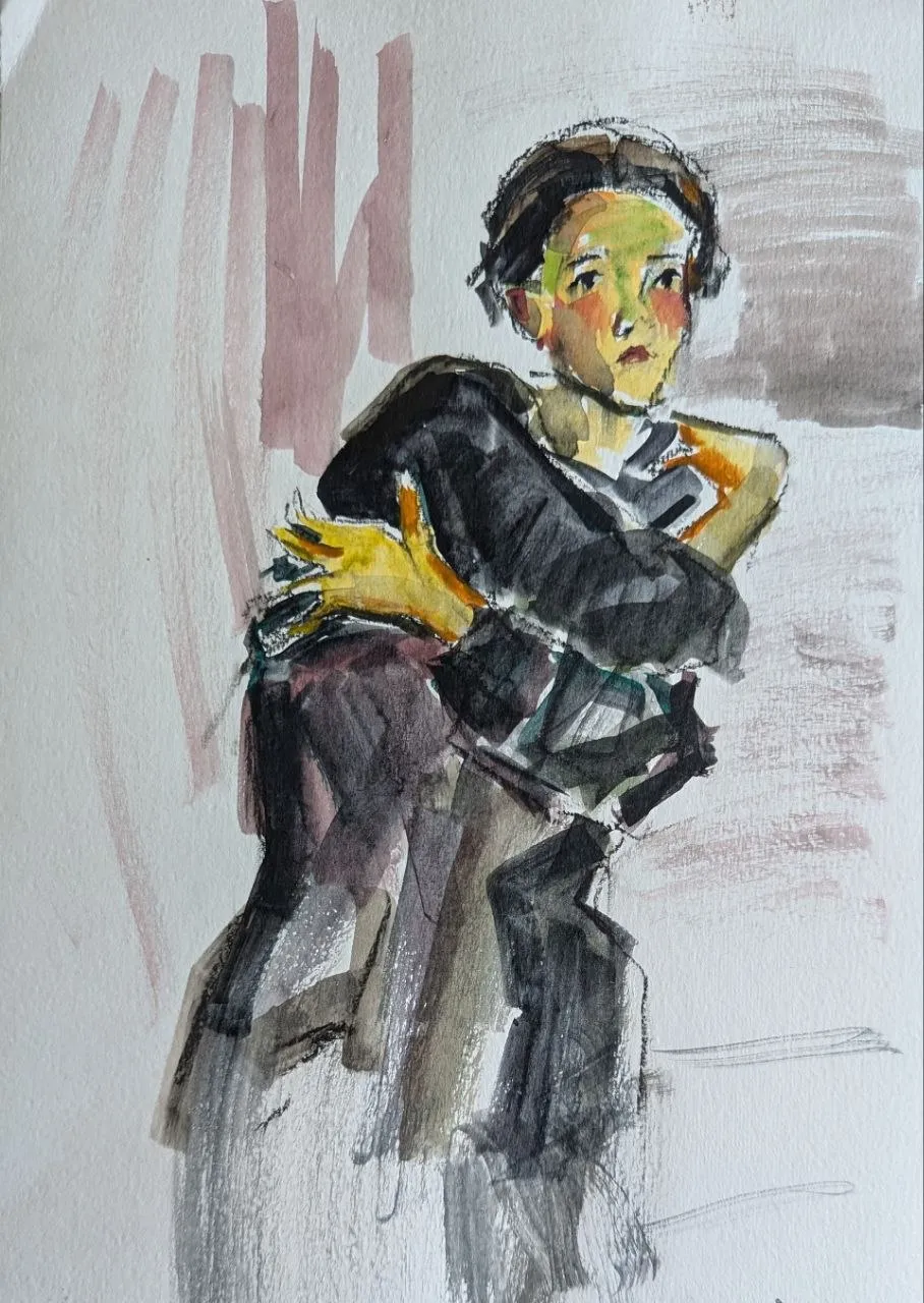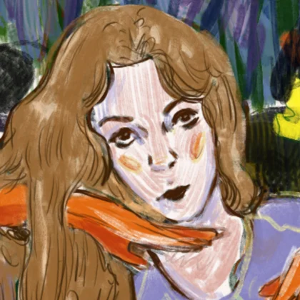
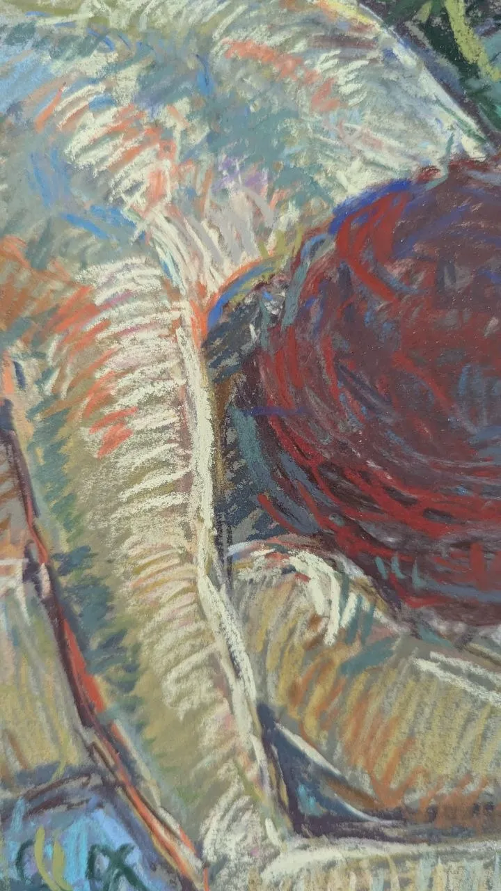
Almost any paper will do for your first attempts, but it is worth understanding its varieties and which is best suited to particular tasks. These principles also apply to other dry media: charcoal, sanguine and black chalk.
Types of dry pastels
Pastels come in varying degrees of softness:
Hard pastels
Hard pastel, usually in the form of thin square sticks, is useful for sketches and fine details. It is less fragile and more difficult to blend; because of its dense pigment, it is harder to apply in multi-layered work.
Soft pastels
Soft and very soft pastels are usually round or cylindrical in shape — they are less dense, glide very easily onto the paper, are well suited to blending and can be easily erased even with a plain piece of cloth.
Personally, I prefer to use soft pastels in my work. I usually start with denser, almost hard sticks, and then gradually move on to the soft ones. This way, the pastel is applied in layers. It’s more difficult to work in the opposite order.
If, on the other hand, you prefer to blend your colours, you can start by using soft pastels and then refine the details at the end.
Paper for pastels
Texture
Traditional pastel paper comes in a variety of colours and has a ‘shell-like’ texture. It feels similar to watercolour paper, but features soft shades — ranging from light greys and ochre tones to rich, vibrant colours.
Personally, I prefer a finer texture, and sometimes even a completely smooth surface, like that of Watman paper.
It is generally believed that texture is necessary for pastels to adhere to the surface: after all, they are essentially just dry pigment. But my experience shows that even ordinary uncoated paper holds pastel very well. The lines turn out sharper on it, as there is no excess texture.
If you enjoy blending, it’s best to opt for textured paper. The pigment spreads more evenly on it, and the transitions between shades look natural.
Many artists now prefer velvet paper. Its pleasant texture makes it easy to blend and mix colours.
Paper tone
The colour of the paper can become an integral part of the composition — its background and foundation.
I love working on coloured paper or card: brown, grey, green, blue — natural, soothing shades.
On white paper, pastel often appears muddy and dirty at first. A coloured background, on the other hand, creates a mid-tone from which you can move freely – towards light or into shadow.
If you only have white paper to hand, it’s easy to add a tinge of colour to it. A thin layer of gouache, sanguine or heavily diluted acrylic paint will do the trick. The main thing is not to use too much water, so that the paper doesn’t warp.
Techniques for working with dry pastels
Dry pastels are a delicate and tactile medium. They glide quite easily onto paper and beautifully highlight its texture. That is precisely why there are various ways of drawing with them – from light strokes to a dense, velvety surface.
Hatching and layering
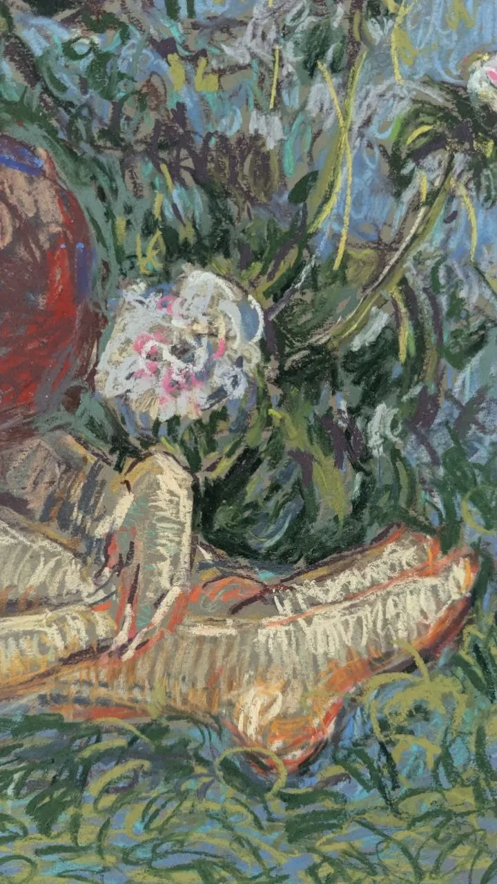
I prefer to work with hatching, and this is also present in my painting. Hatching lets me emphasise form, preserve the purity of colour and add expressiveness. It is very useful for multi-layered work.
Blending
Blending creates soft transitions, a sense of lightness and airiness. It is favoured by those who appreciate realism.
You can draw with a broad stroke using the side of the pastel and then blend it with your finger, a piece of cotton wool, a brush or a paper blending tool.
Colour mixing
Pastels blend easily directly on the paper. Simply stroke a new colour lightly over the old one to create a soft transition. You can build up to five or six layers, as long as the pastel allows it and does not start to slide.
The ‘optical mixing’ technique also works well: colours do not blend into one another, but remain side by side in the form of strokes or dots.
When drawing, make sure you have a cloth to wipe your hands – pastels are a very fragile material and get dirty easily.
Securing and storage
Unless fixed, a pastel drawing remains vulnerable — even a slight accidental touch is enough for the pigment to rub off or flake away. This is particularly true of soft pastels: their particles adhere to the paper solely because of the surface texture.
Therefore, fixing is an essential step. Special varnishes for dry media, known as fixatives, are used for this. They are sprayed onto the drawing in a thin, even layer from a distance of about 30–40 cm. This helps to set the pigment without losing the intensity of the colour.
Sometimes artists use hairspray that is free from glitter and oils.
Before using any new fixative, you should first carry out a test on an area other than the artwork.
If a piece is intended for an exhibition, it is best to mount it with a mat and glass.
When there are many pastel drawings, it is easier to store them in folders. Unfixed works should be separated with sheets of tracing paper or thin paper so that the pigment does not flake off or transfer to neighbouring sheets.
Why do I prefer it?
I could paint in oils; there was a time when I did. I used to paint exclusively in oils.
But oil painting is known as ‘easel painting’ because it requires an easel. When moving house frequently, it’s not feasible to have an easel and canvases of various sizes. This requires space, a well-ventilated room and time for the paintings to dry. Pastel has become an alternative for me. It doesn’t need to dry, and it’s light. All you need is paper, pastels and varnish to set them. That’s why it has recently become my favourite medium. I like its texture, its vibrancy and how easy it is to work with.